
A Feel for Paper: Choosing the Right Stock for Your Greeting Cards
Choosing the Right Paper for Your Greeting Cards
You’ve spent hours getting your design just right. Now comes another decision: what should you print it on?
Paper is a big part of how a greeting card looks and feels. The same illustration can take on a different character depending on the surface, shade and weight you choose. Whether you’re printing your first collection or trying something new, it helps to get a few different stocks in your hands.
Start with the feel
Think about someone picking your card up from a shop display. A textured stock might complement a hand painted illustration, while a smooth surface could suit crisp lettering or detailed photography.
There’s no single paper that works best for every design. Try to choose something that feels at home with your artwork and the character of your collection.
Get to know your paper weight
Paper weight is measured in grams per square metre, usually shortened to gsm. A higher number means a heavier stock, although two papers with the same gsm can still feel quite different.
Thickness, texture and stiffness all affect how a finished card handles and stands. Holding a folded sample will tell you much more than a number on a specification sheet.
Think about colour
The shade of your paper becomes part of your design. A bright white stock can give colours a different appearance from a warmer, cream coloured paper, particularly where areas of the stock show through.
It’s also worth remembering that a screen produces colour using light, while print relies on ink and paper. Your finished card may therefore look slightly different from the artwork on your laptop.
Printing conditions, including temperature and humidity, can also influence colour during the day. Colour checks and press calibration help manage those variations and keep results consistent. If a particular shade is important to your design, speak to your printer about checking a printed sample on your chosen stock.
Leave room for a message
The inside deserves some thought too. Your customer needs somewhere to write a birthday wish, a thank you or a few words to someone they miss.
Consider how easily a pen will write on the surface and whether any printed elements leave enough clear space for a personal message. It’s a small detail that matters when the card is being used.
Try it before you choose
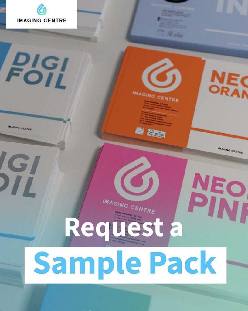
A photograph can show you a paper’s colour, but it’s much harder to judge its texture or how it feels when folded. Samples give you a chance to compare options properly and picture how your collection will come together.
At The Imaging Centre, we’re always happy to talk through paper choices and help you find something that suits your designs.
Request a free sample pack to explore the options, or get in touch with our team for a little guidance.
In Short…
Your Idea. Our Expertise. One Finished Product.
Publishing is all about creativity. You have the ideas, the personality, and the designs that make your brand unique. Our role is to help turn those ideas into something real.
From that first sketch in your notebook to the moment your finished card lands on a retailer’s shelf, we are here to help bring your ideas to life. Having an experienced print partner behind you means you can spend less time worrying about production and more time doing what you love.
Ready to take your designs from sketchbook to shelf? Request a free sample pack to explore our range of stocks, finishes and products, or contact a member of The Imaging Centre team today.